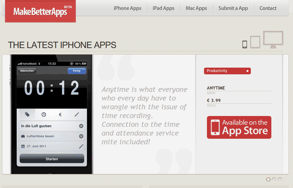
A Sticky Menu is a menu that stays put even when you scroll down. I’m using one on this page - scroll to the top and the menu bar hugs the top of the page. Scroll down slightly and it follows you instead of disappearing.
Hit play on the video below and watch as the navigation bar at the top of makebetterapps.com stays put as the user scrolls down the page:
Your site must be snappy to surf to delight your visitors
“That’s great, but why use it?” I hear you ask! Let me detail a bit of the rational behind it’s usage.
The Importance of Navigation
Navigation is typically the backbone of the usability of a site, and so naturally it’s efficiency of use is of paramount importance.
Given that a typical website has a window of opportunity of less than 10 seconds in which to grab the attention of your visitor, any usability roadblocks will send your visitors bouncing off to competing websites.
Your site must be snappy to surf to make your visitors delighted.
The UX Pattern
The internet hive brain came up with a clever design pattern to improve navigation accessability. The menu is made to “stick” to the top of the page even when scrolling, so it’s always accessible.
Smashing Magazine’s Hyrum Denney conducted an experiment that discovered that Sticky Menus increase navigation speed by a whopping 22%!
Limitations
Of course one drawback of the sticky menu approach is it’s intrusiveness. Something that the user might expect to disappear lingers on the page.
Navigation is typically designed to be bold so the user notices it. Having something eye grabbing distracts from your other valuable content.
The solution
As you will have noticed by now, when you scroll down on this page three things happen:
- The navigation bar sticks to the top of the page
- It’s height is shrunk slightly
- It’s made semi-transparent
De-emphasize your navigation when it gets in the way of your other valuable content
I decided to adopt the Sticky Menu paradigm because of the sheer efficiency gains that my visitors would enjoy. Reducing the nav bar’s height frees up valuable screen real estate, and making it semi-transparent reduces it’s weight and de-emphasizes it. The result is a more efficient and pleasent navigation experience.
The nav styling changes are also animated smoothly using CSS3. This is a touch that will go towards delighting the user with very little processing overhead.